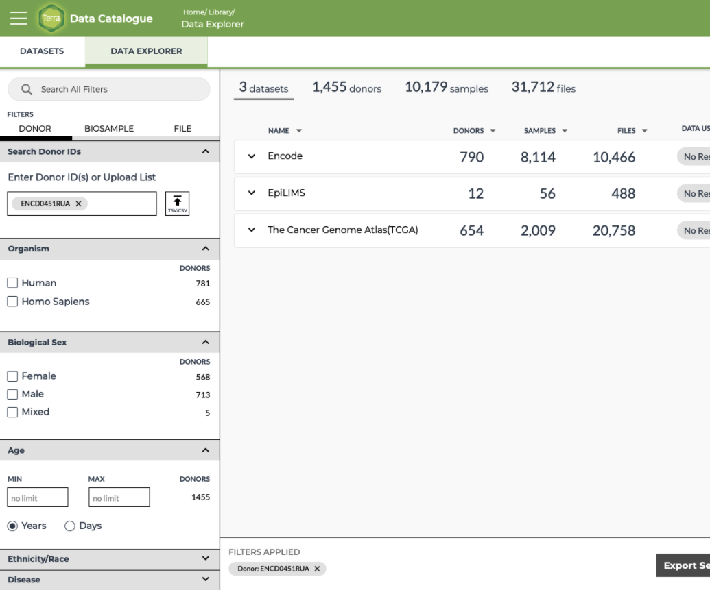
Terra’s biosample data explorer
User problem
Cancer researchers often need to connect specific genes to certain cancers by gathering clinical and genomic data from multiple sources. This process is typically slow, fragmented, and inefficient.
Goal
Design an interface that enables streamlined cross-database search, helping researchers spend less time on data collection and more on discovery.
Timeline
4+ Months, 2020
Scope of work
Led discovery and interface design
Created new components within Terra’s design system
Worked closely with PM and data modeler on technical feasibility
Navigated stakeholder relationships to ensure alignment
Background + Goal

The challenge of finding data
High-quality data fuels scientific discovery, yet for genomic researchers, locating that data remains a tedious and time-consuming task.
Lack of visibility
While Terra offers access to numerous public datasets and analysis tools, users struggle to understand what data is available and how much exists—creating a barrier to exploration.
User quotes
“There’s more than a million biosamples in Terra, but how do I find what I need?”
“I want to be able to easily identify how much accessible data exists for the research questions I have (i.e., identify driver mutations for breast cancer).”
“Is it the right data? Is the relevant data sufficiently abundant? Is relevant data qualified for my requirements?”
Adding clarity through user journey mapping
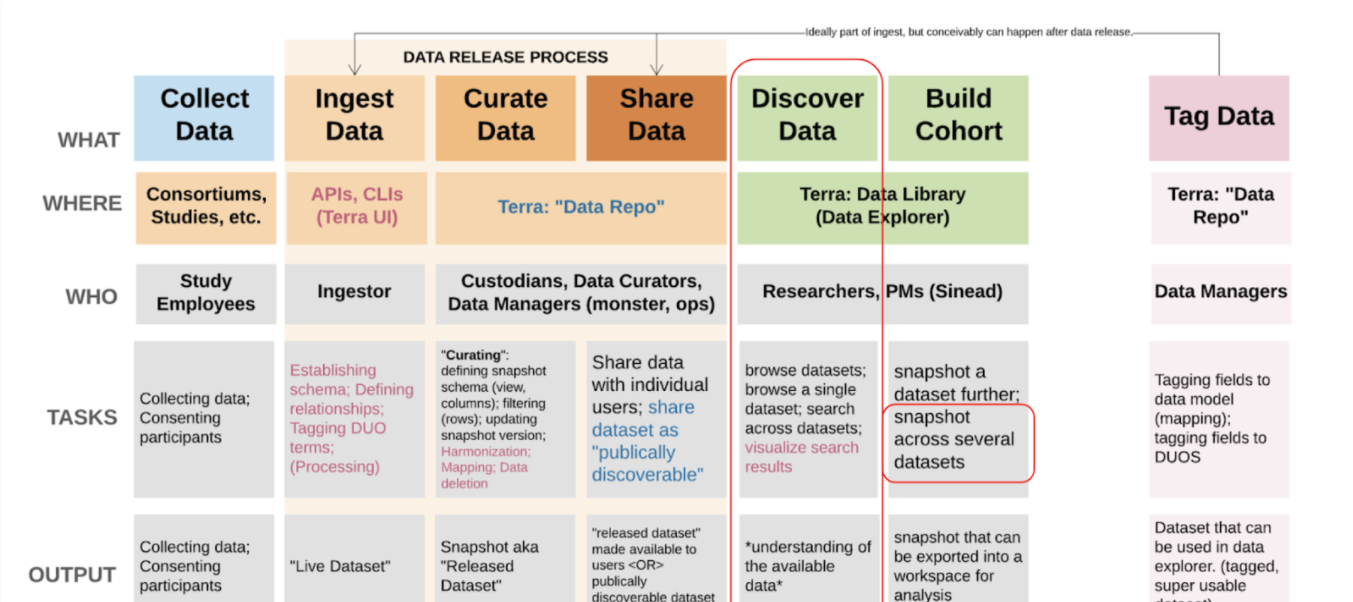
Due to the innovative and evolving nature of Terra, product requirements were initially ambiguous. User journey mapping helped align stakeholders and product managers by clarifying scope, surfacing user needs, and grounding the experience in real workflows.
Design principles
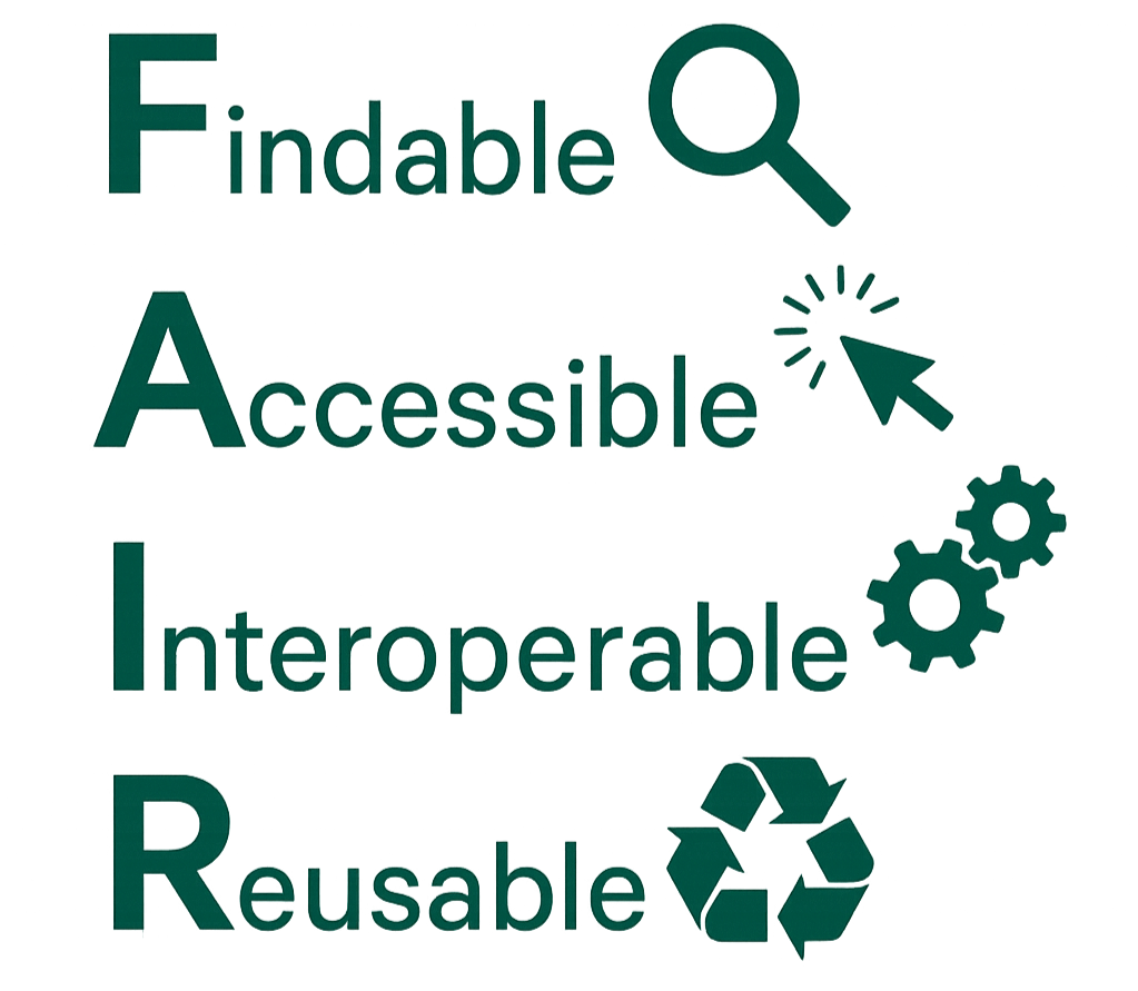
My design goals match FAIR data principles, so I framed them accordingly:
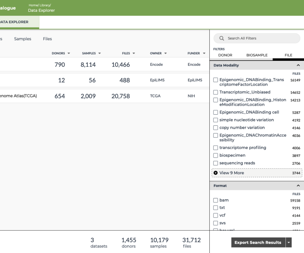
Show available filters and values clearly to make data easy to find.
Clearly state how accessible the data is.
Highlight shared features across datasets linked by our common data model.
Make it easy to export relevant data to Terra workspaces, improving data tracking and encouraging data reuse.
Exploring search and refinements
Early-stage sketches to rapidly explore structure, flow, and key interface elements.
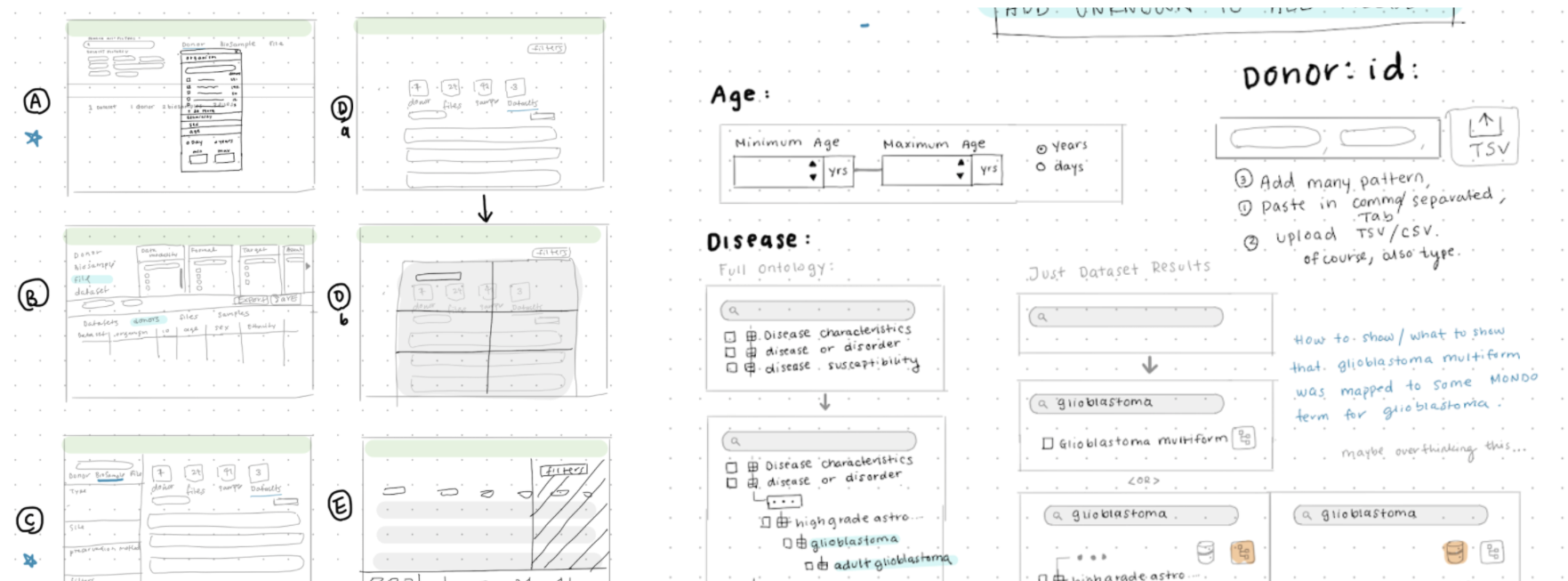
Early concepts tests
I developed mid-fidelity wireframes to explore multiple layout directions and gathered feedback from stakeholders, subject matter experts, and user representatives to understand their priorities. I also tested approaches for summarizing search queries in a way that was both clear and semantically meaningful.

What I learned
Result visibility vs. filters
Users don’t need to see filters and results side by side — just the result counts.
→ This allowed filters to take over the screen, simplifying layout and interaction.
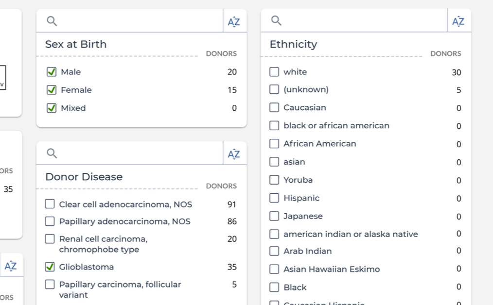
Filter option overload
Users wanted to sort filter values alphabetically and search within them, since options weren't organized by ontology.
→ I added internal search and sorting within each filter group.

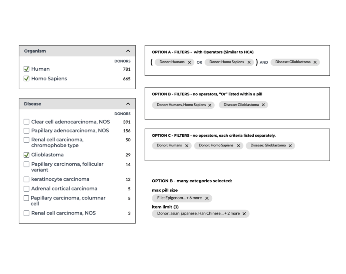
Boolean query summaries
Users responded best to summaries that visually reflect how filters combine.
→ I designed a clear, visual representation of the query logic, making complex searches easier to interpret at a glance.
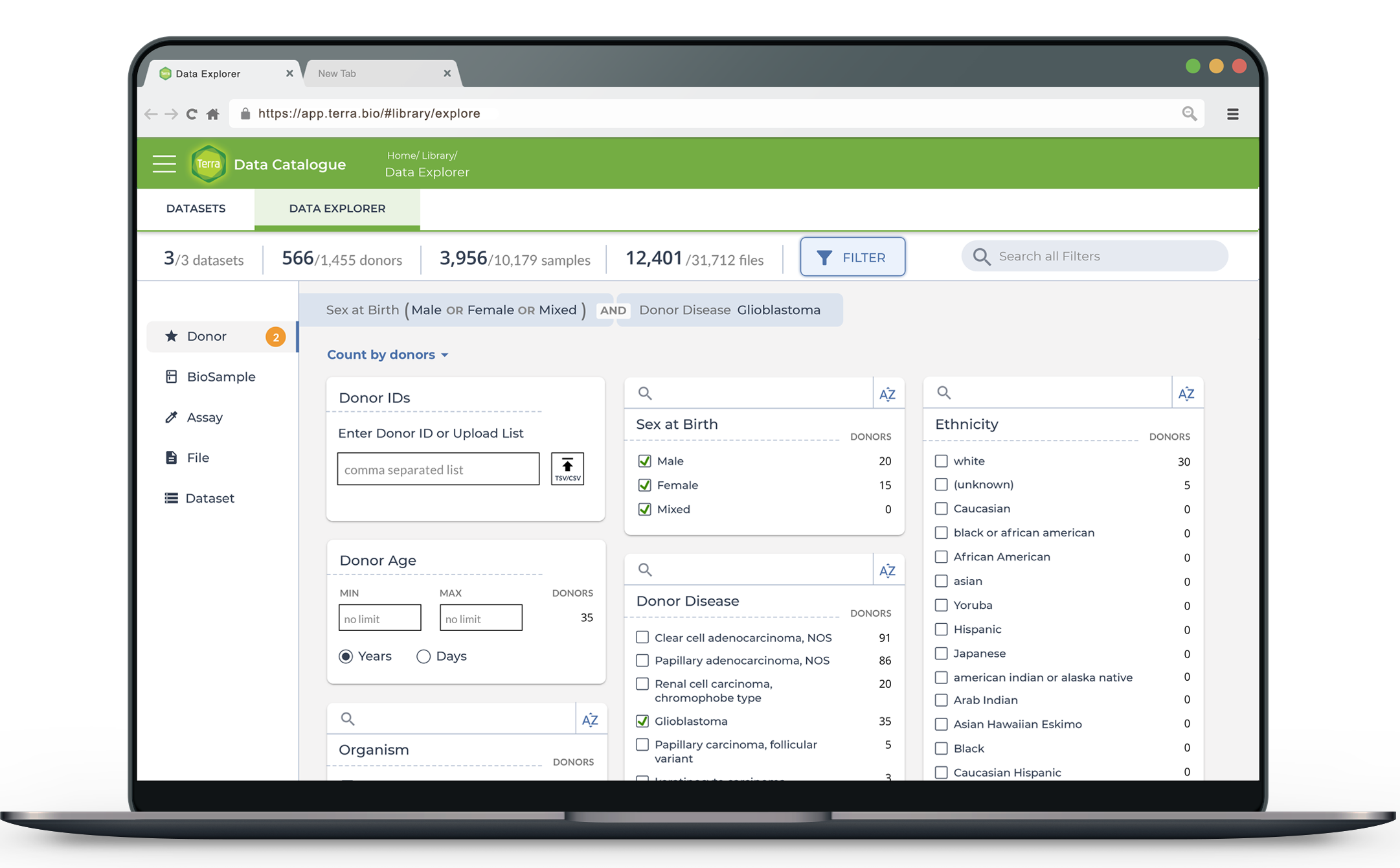
High fidelity mockups

Impact
Helped shape product vision and development planning by clarifying user needs and system requirements
Informed the next phase of design, now in progress, incorporating expanded requirements
Current focus includes integrating data access request flows and designing a comprehensive data catalog experience
More projects
-
DFCI Curation Platform
-
Broad's COVID-19 Dashboard
-
DFCI Patient StatusBoard